From an Empty Folder to a Figure using Claude Code
Video 2 in a series on Claude Code
Part 2 of a series on AI coding tools for empirical research, accompanying my Markus Academy video series.
In the last post, I walked through getting Claude Code set up and a high-level discussion about how to to think about using it as a tool. Now let’s use it in practice.
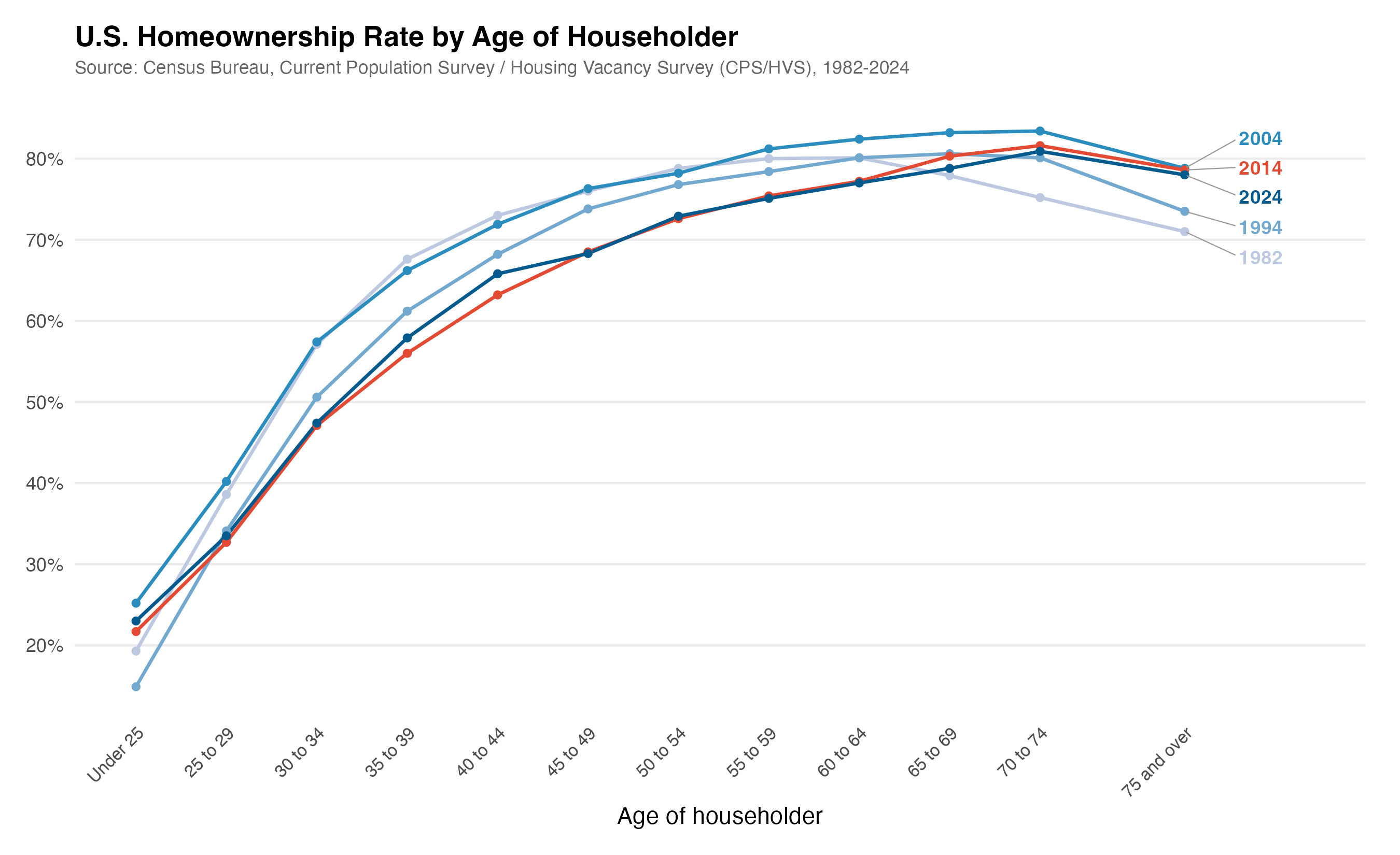
The question for today: how has the age distribution of homeowners changed over the last 50 years? This is a topic close to my own research—I have a paper with Kelly Shue on gender gaps in housing returns—and it’s the kind of descriptive question that comes up when you’re scoping a new project. I’d actually posted a version of this figure on social media recently, and it made for a good demo. We all know there’s been this discussion about a shift—younger folks are not owning homes as much as older folks. But what does the data actually look like? Let’s go look.
Having Claude go get the data
I open Claude Code in a brand-new directory and describe what I want. I’m deliberately vague about where the data lives—I know the Census Bureau publishes it, and I think it might be on FRED, but I don’t have the exact table number or series ID. I’ve done this once before as a test project, but I don’t really remember exactly how to get it. It’s kind of just like you’d ask an RA to do something.
> I'm starting a new project from scratch. I want to analyze how the
  age distribution of homeowners in the US has changed over the last
  50 years. I think the Census Bureau publishes homeownership rates
  by age of householder from the Census. Potentially, the data is
  available through the Census website or through FRED.

  Download homeownership rates by age going back as far as possible.
  Write this as download_data.py. Save the raw data as a CSV.
What happened next is worth describing in some detail, because it illustrates how these tools actually work in practice—it’s not a clean straight line.
Claude’s first instinct was to try FRED. It knows the Census Bureau’s Housing Vacancies and Homeownership Survey (CPS/HVS) publishes homeownership rates by age, and that FRED carries some of these series. It found the overall homeownership rate series (RHORUSQ156N) easily enough. But then it got stuck trying to pin down the exact FRED series IDs for the age-specific breakdowns. You could see it going in circles—trying to recall the naming convention, guessing at series codes, not finding them. (Markus asked during the video whether you could have had one agent searching FRED and another searching the Census in parallel. The answer is yes—if we’d been more specific, Claude might have done that on its own, but I was vague enough that it went sequentially.)
Then it hit a more practical wall: the Census website threw a 403 error. A 403 error means the Census wants you to pretend to be a person—it doesn’t want bots just hammering it with requests. So Claude had to put a user-agent header on its requests, basically saying “hey, I’m a browser.” This becomes an issue whenever you start scraping, and we’ll talk about it more in the next video. If you’re interested in scraping, you have to be careful and diligent about how you interact with websites—a lot of them set things up so they aren’t bombarded by requests from web scrapers.
Once Claude got past that, it found two relevant tables on the Census Bureau’s website: - Table 19: Quarterly homeownership rates by age of householder, 1994 to present. Broad age groups (Under 35, 35-44, 45-54, 55-64, 65+). This is exactly the data you’d want, but it only goes back to 1994. - Table 12: Annual household counts (total and owner-occupied) by detailed age group, 1982 to present. More granular age breakdowns, but you have to compute the rates yourself from the counts.
Claude decided to pull both—different tradeoffs, both useful. It downloaded the Excel files, inspected their structure (these are messy government spreadsheets—multiple blocks of data, footnotes, merged cells), wrote parsers for each, and produced two clean CSVs. The whole process took about six minutes and 21 seconds.
I want to highlight a few things here. First, Claude made real decisions—it chose to pull both tables because they offer different tradeoffs, it computed rates from household counts when it couldn’t find pre-computed rates, and it handled the messy Excel parsing without me specifying the structure. Second, it hit a dead end with FRED and recovered. The 403 error broke the download; it figured out the user-agent fix. This is what actual data work looks like, and it’s exactly what you’d want an RA to do. I didn’t tell it to do any of this—I just said go back as far as you can.
Third—and this is important—the process wasn’t magic. The more specific you are in your query, the better it does on these types of tasks. If I’d known the exact Census table number, I could have told Claude and saved it the crawling step. But even with a deliberately vague prompt, it figured it out.
Markus asked whether you’d get the same data sources if you ran this task repeatedly. My guess is yes—there’s really one very good answer for this question (the Housing Vacancy Survey from the Census Bureau), and Claude should converge on it each time.
A note on sub-agents and the context window
One thing to notice during this process is that Claude spawned a sub-agent to do the web research. The main agent said to it, “Hey, you need to go look for Census homeownership data.” That sub-agent had its own context window—so it could search for “homeownership rate under 35” and “homeownership tables” and page through results without filling up the main conversation’s context. The sub-agent then reported back what it found. It’s how Claude manages a task that involves a lot of searching without blowing out the context window we talked about in the last post.
Another related point: Claude didn’t download and look at every row of data before writing the script. It read a bit of the Excel files—enough to understand the structure—and then wrote a parser based on that understanding. If you had perfect memory, you wouldn’t look at every row either. You’d glance at the structure, figure out the pattern, and write the code. Same idea.
Claude Code vs. Cowork on the same task
In the video, we ran this same task on Claude Cowork in parallel, just to see how the two compared. Cowork found the same Census data sources—it’s the same underlying model, so there’s no reason it shouldn’t. But it struggled with one thing: the sandbox. Cowork runs in a sandboxed environment, which means it can’t easily make web requests the way Claude Code can on your local machine. It wrote a download script, but the script couldn’t actually execute and query the Census website from inside the sandbox.
This is the tradeoff we discussed in the last post. Claude Code has full access to your local filesystem and network—we told it “go access the web, do whatever you want.” That’s powerful but means you need to be thoughtful about permissions and security. Cowork is more restricted, which removes a lot of privacy concerns but also limits what it can do autonomously. For data acquisition tasks like this one, Claude Code has a clear advantage.
Making the figure
This is where iterating through conversation is much faster than hand-tuning code. And I want to share a trick here—this is the number one cheat that I’ve found to be really helpful.
There’s a professor of sociology named Kieran Healy who has a wonderful book called Data Visualization. It makes beautiful graphs. So when I ask Claude to make a figure, I can say:
> Please make a script to generate a figure in R with this data.
  Please follow the best practices of making figures from Kieran Healy.
Claude immediately translates this into specific principles: clean ggplot2, direct labeling, minimal chart junk, thoughtful color, and clear typography. It wrote 77 lines of R code and ran it.
The first version had some issues. Healy has very strong preferences for fonts, and Claude tried to use his preferred fonts, which led to a debugging session with the Cairo graphics device. There’s actually a whole blog post from Kieran Healy about this exact font issue—so it’s a well-known problem. Claude worked through it and got the figure rendering.
But the figure it produced showed the data in broad age buckets—just the five big groups—plotted as a time series. That’s useful, but I wanted something more like the figure I’d made in my earlier test: age on the x-axis, with different lines for each year, so you could see the distribution shifting over time. So I told it:
> This is great, but I want a graph where age is on the x-axis
  and the distribution is on the y-axis and there are different
  lines for each year. Do you have sufficiently fine-grained
  age data for this? Can you go back and find more age buckets?
Claude said yes—there were finer age buckets available that it hadn’t used the first time. It re-downloaded from the more detailed Excel file, re-parsed the data, and regenerated the figure with the finer age breakdowns. It even noticed that the year labels were overlapping and fixed the spacing on its own. It really is like a good RA in the sense that it tries to make nice graphs for you—it doesn’t always catch problems, but for straightforward issues like overlapping labels, it will often fix them without being asked.
A few rounds of iteration, and we had a clean figure showing the homeownership distribution by age at different points in time. You can see the crisis—2024 looks very similar to the post-financial-crisis period, and 2004 was when homeownership was highest across the board. This is the kind of thing that would take an hour of fiddling with ggplot2 parameters to get right on your own.
One thing you might notice watching the video: while Claude works, it displays status words like “cogitating” or “justiculating.” These are meaningless filler terms it shows while thinking—they don’t indicate anything about the process. You can change them. They’re just nonsense.
One observation from the video: Markus asked whether saying “please” makes a difference. Honestly, I don’t know. I’m just overly polite. There is some literature on whether being polite or rude to LLMs affects their output, but I find it hard not to just say please.
What’s done locally vs. in the cloud
Markus asked about this directly: everything that involves the LLM—the text generation, the reasoning about what script to write—happens in the cloud. But the actual execution of the R script happens on my computer. You need to have R installed locally for this to work. If you don’t have R, you could ask Claude to use Python instead, or you could ask it to install R for you. But the code runs on your machine.
The figure I made earlier
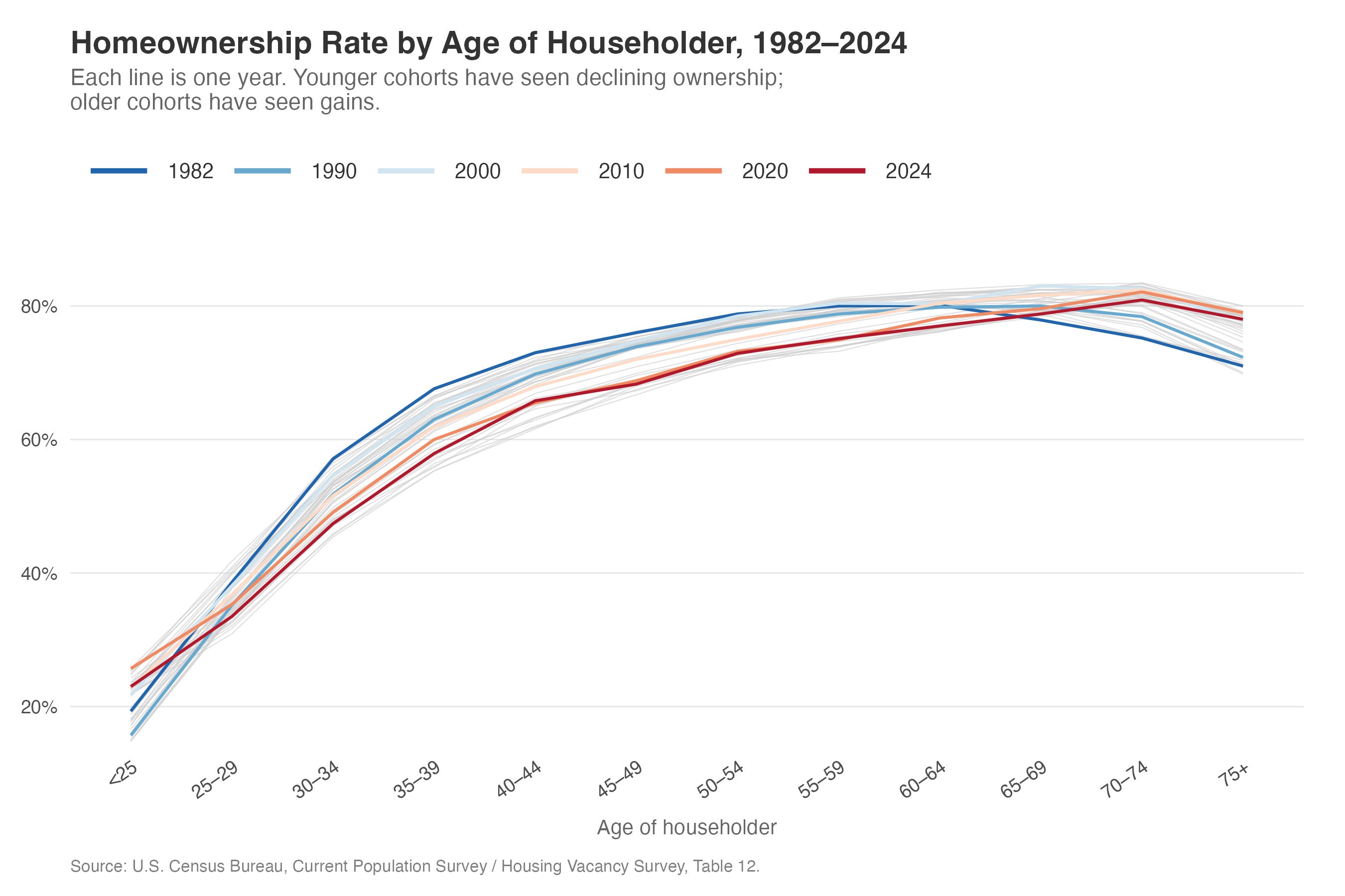
I also showed in the video a figure I’d produced in an earlier test run—the one that got me interested in doing this as a demo. That version used R as well, with gray lines showing every year and colored lines highlighting specific decades. Claude wrote all the R code. I basically just told it what I wanted it to look like roughly and it did everything else. I kind of hinted at the style, but it would be a stretch to say I told it to make it look exactly like that.
That earlier figure is what you’d expect from the Housing Vacancy Survey: homeownership rates rising with age, the distribution shifting rightward over time (older households gaining homeownership share, younger ones losing it), and a visible dip during the financial crisis that hit younger age groups much harder than older ones. The 2004 peak is clear, and you can see that the crisis years look very similar to where we are now in 2024.
Summing up
You tell Claude what you want a graph to look like. It does it. Before, you ran a lot of things and went back and forth, fiddling with ggplot2 parameters. Now you have a conversation—the same kind of thing you’d say talking to a person. You iterate. You add stylings. And in the end, you have everything in one folder that looks like a project: scripts, data, figures, all reproducible.
The key thing: Claude does the data acquisition, works with you on the figure, and you’re always generating scripts so you can rerun everything later. The judgment—which age groups to highlight, what comparison matters, what story the figure should tell—remains yours.
A few specific things I’ve learned doing this:
Let Claude do the data acquisition. This was the biggest shift in my workflow. Instead of spending 20 minutes navigating the Census website, finding the right historical table, downloading the Excel file, and writing a parser for the messy formatting—I describe what data I need and Claude figures it out. It doesn’t always get it right on the first try, but the iteration is fast, and it recovers from dead ends on its own.
Reference styles you like. Telling Claude to follow Kieran Healy’s best practices is much more effective than specifying individual ggplot2 parameters. You can do the same thing with journal styles—“use the style from the Quarterly Journal of Economics” gives it a concrete target. You’re directing the visual output, not the implementation details.
Iterate in small steps. Don’t try to specify everything in one prompt. Get a first draft, then adjust. “This is great, but I want age on the x-axis” is a perfectly good follow-up. Three rounds of small changes beats one massive specification.
Always generate scripts, not just outputs. I keep coming back to this because it’s tempting to just say “download the data” and let Claude do it interactively. But the script is what matters for reproducibility. Ask for
download_data.py, not “download the data.” I could just rerun that code anytime I want.The judgment is still yours. Claude pulled the data and made the figure, but I brought the question—which distribution to show, what comparison matters, how to present the shifting age distribution. The research decisions remain human decisions. Claude just made the implementation instant.
What’s next
In the next post, we tackle something more ambitious: scraping SEC EDGAR to build a dataset of corporate filings from scratch. Claude handles the API calls, the batch downloading, the section extraction, and the quality checking. That one will make it more clear what this really unlocks.
This is the one that made it click for me. The FRED dead end, the 403 error, the user-agent workaround — that sequence is exactly what real data work looks like, and seeing Claude navigate it without hand-holding is genuinely different from anything I've seen in a browser-based workflow.
The Kieran Healy tip is something I'm stealing immediately. Referencing a concrete visual style instead of specifying parameters one by one is such a cleaner way to work. That kind of shortcut only comes from someone who's actually put hours into this.
What you're describing here — from empty folder to reproducible figure in a single session — is the exact workflow gap we're trying to close with a course we're building called "Master Claude in the Real World." Most people using Claude are still copy-pasting between tabs. This series is proof of what's actually possible on the other side. We just launched on Kickstarter for anyone who wants a structured path to get here faster: https://shorturl.at/ZrG8p
The scraping post can't come soon enough. SEC EDGAR is going to be a good one.